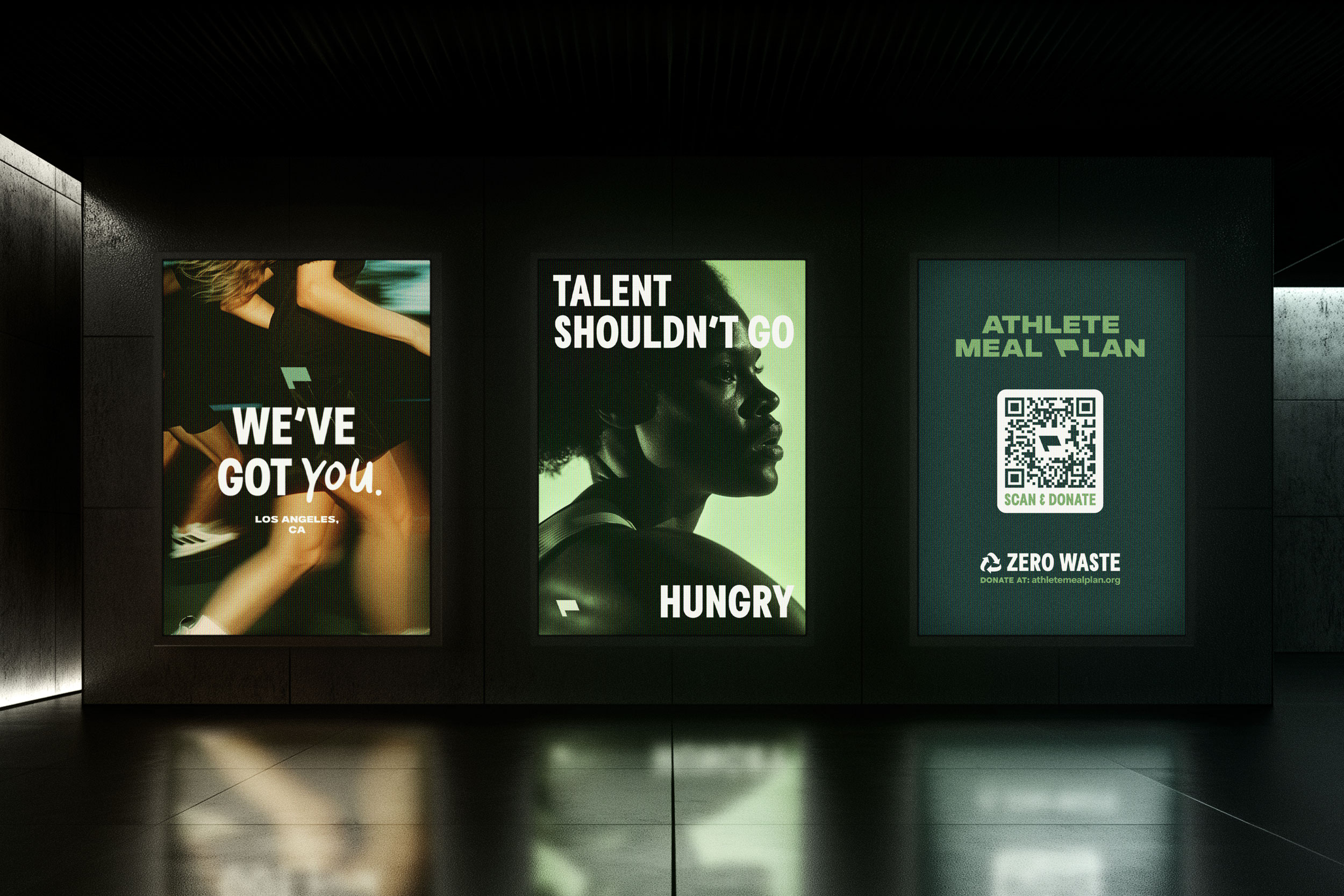
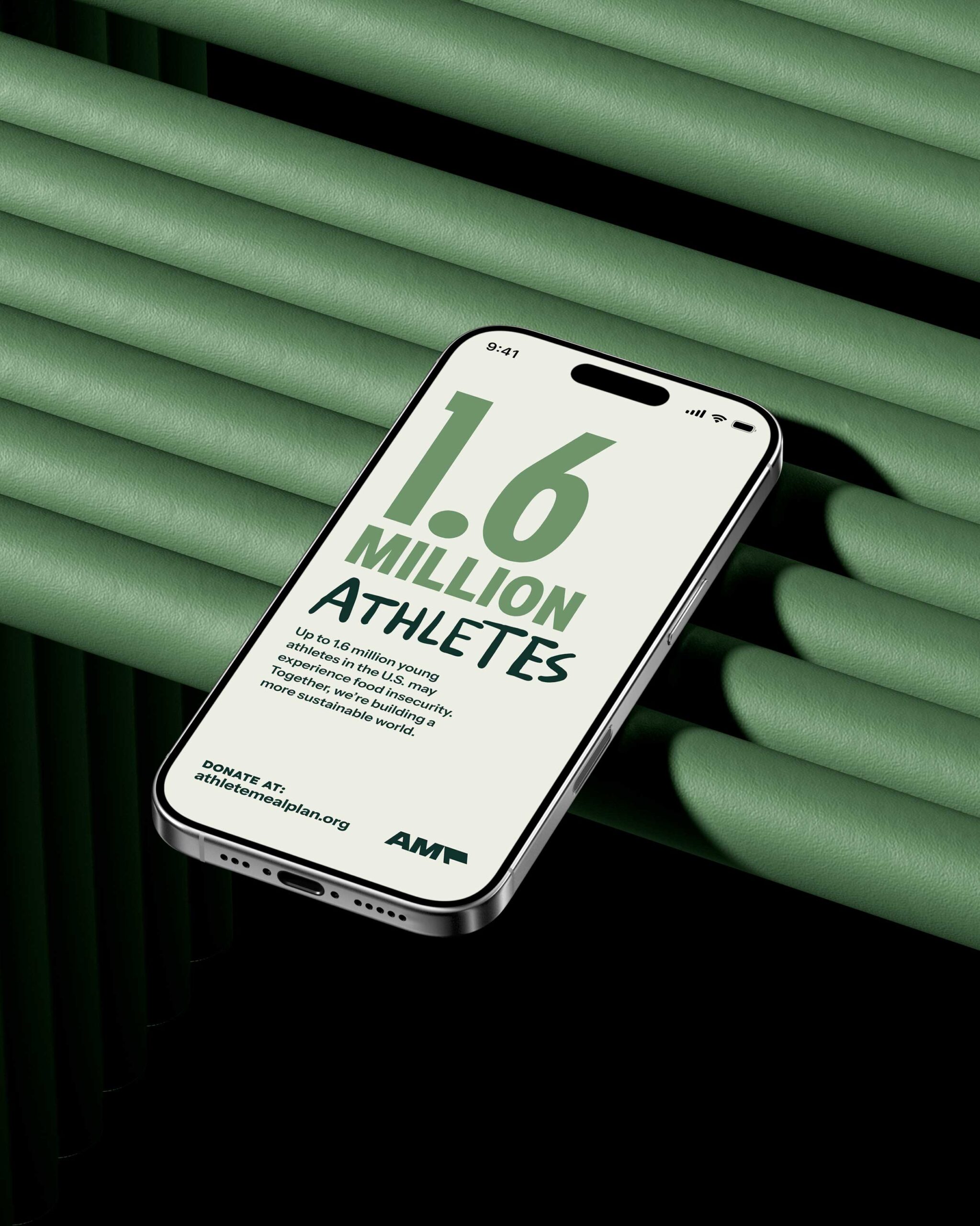
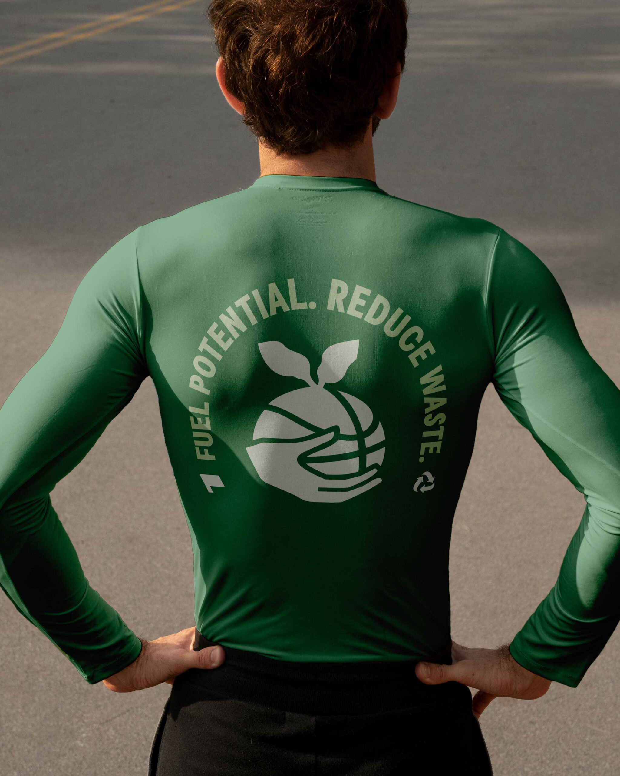
AMP’s identity system reflects the brand’s innovative yet grounded nature. A green and functional color palette reinforces both nourishment and sustainability. Typography balances friendliness with clarity, ensuring accessibility without losing impact. Just like every meal delivered by AMP, the design is intentional — crafted with care, functionality, and a focus on empowerment.
At the heart of the brand stands a flag: a symbol of action, pride, and commitment. It’s a visual call to rally, representing the brand’s hands-on dedication to supporting athletes and caring for the planet. Carrying this flag means being part of a movement that drives real change. It invites athletes, partners, and supporters to unite around a shared mission for greater equity and sustainability.