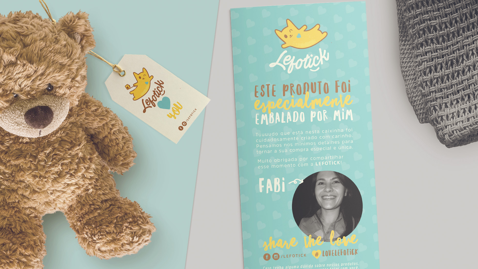
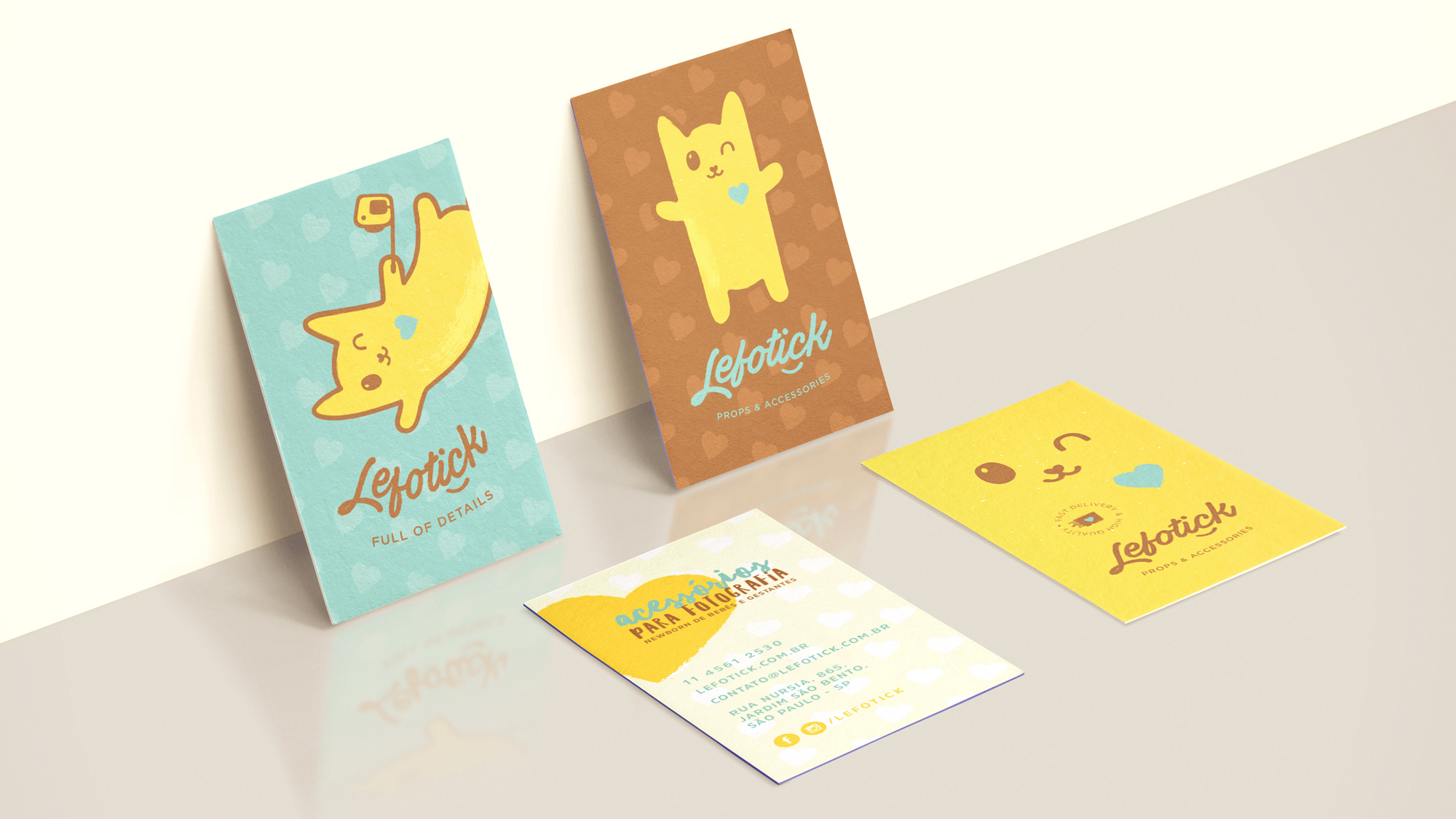
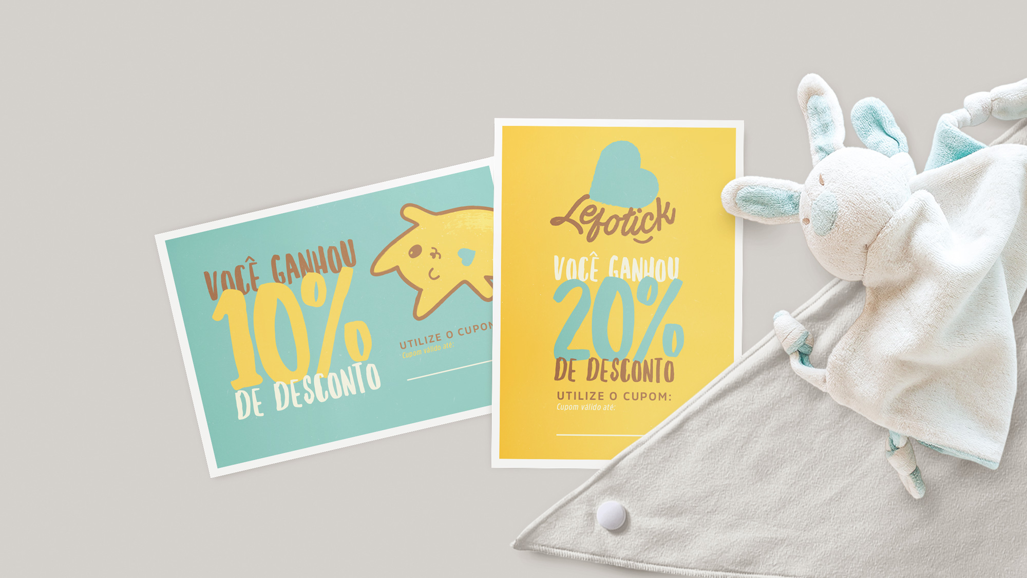
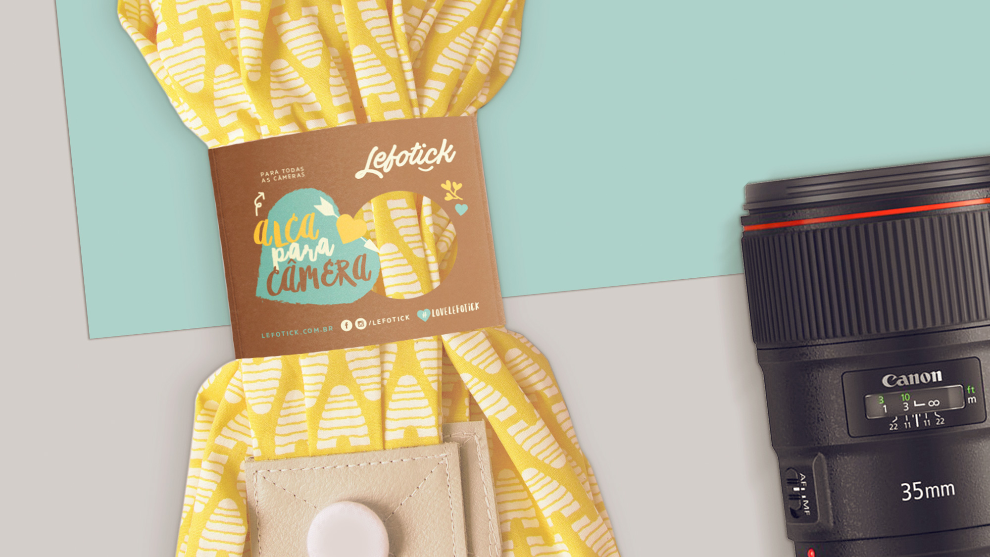
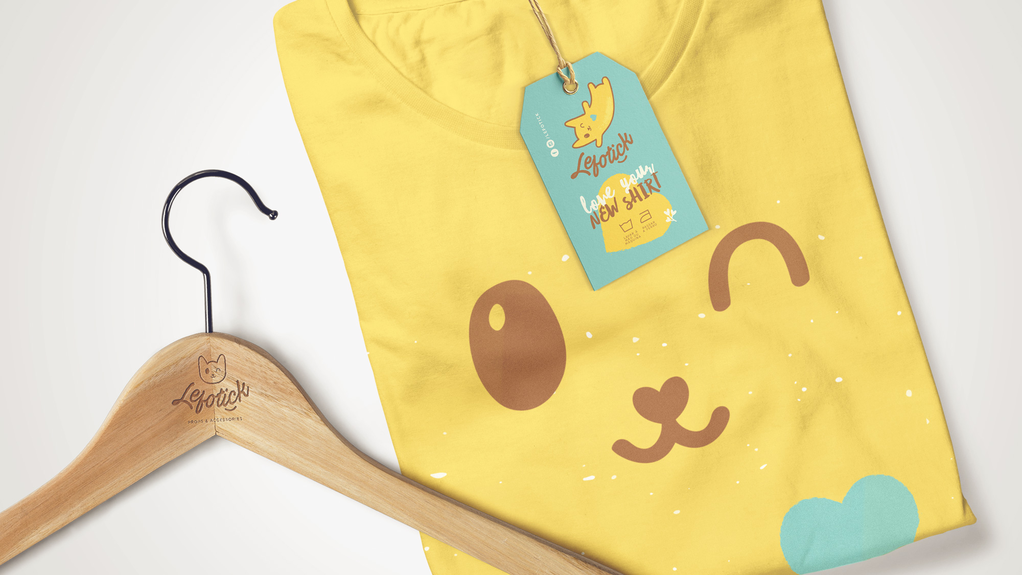
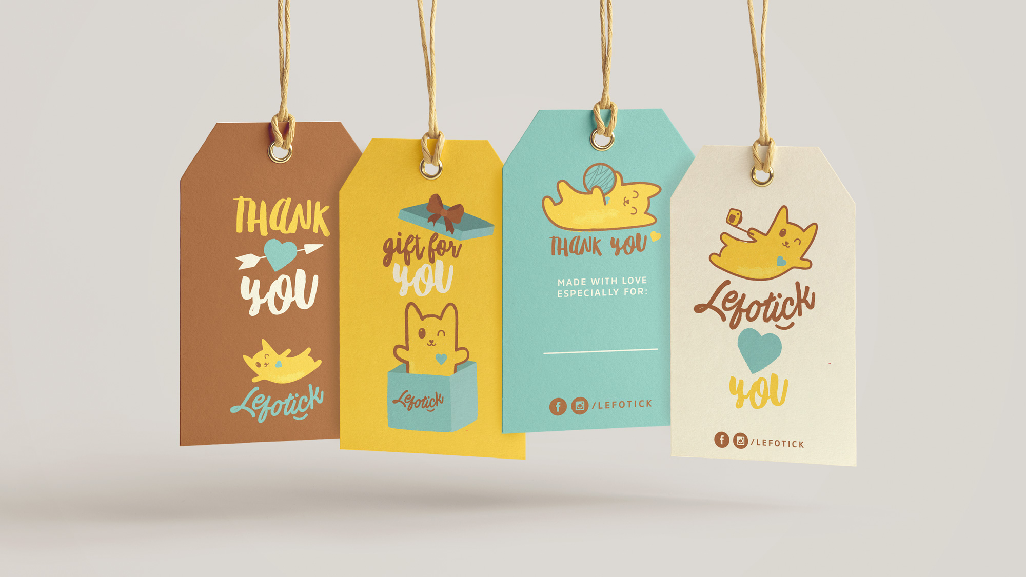
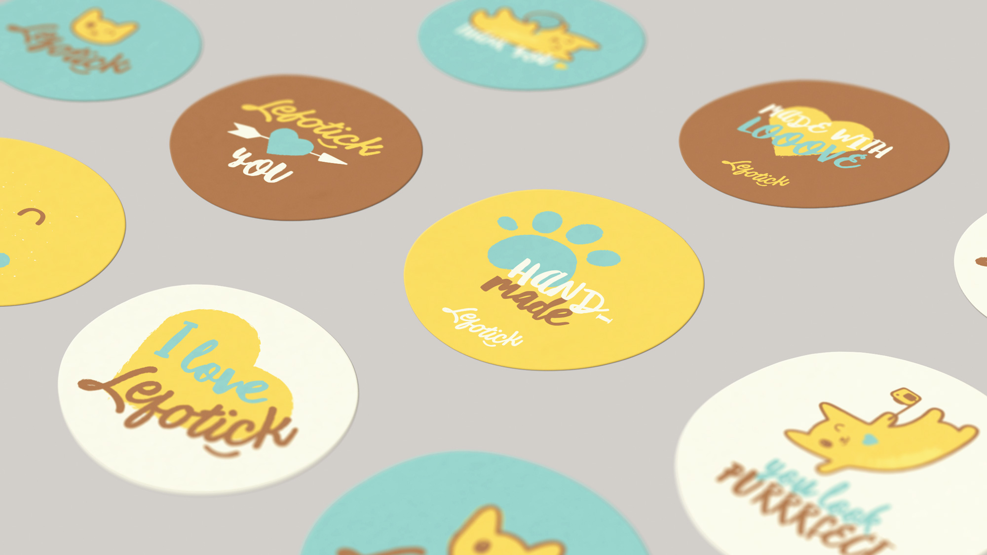
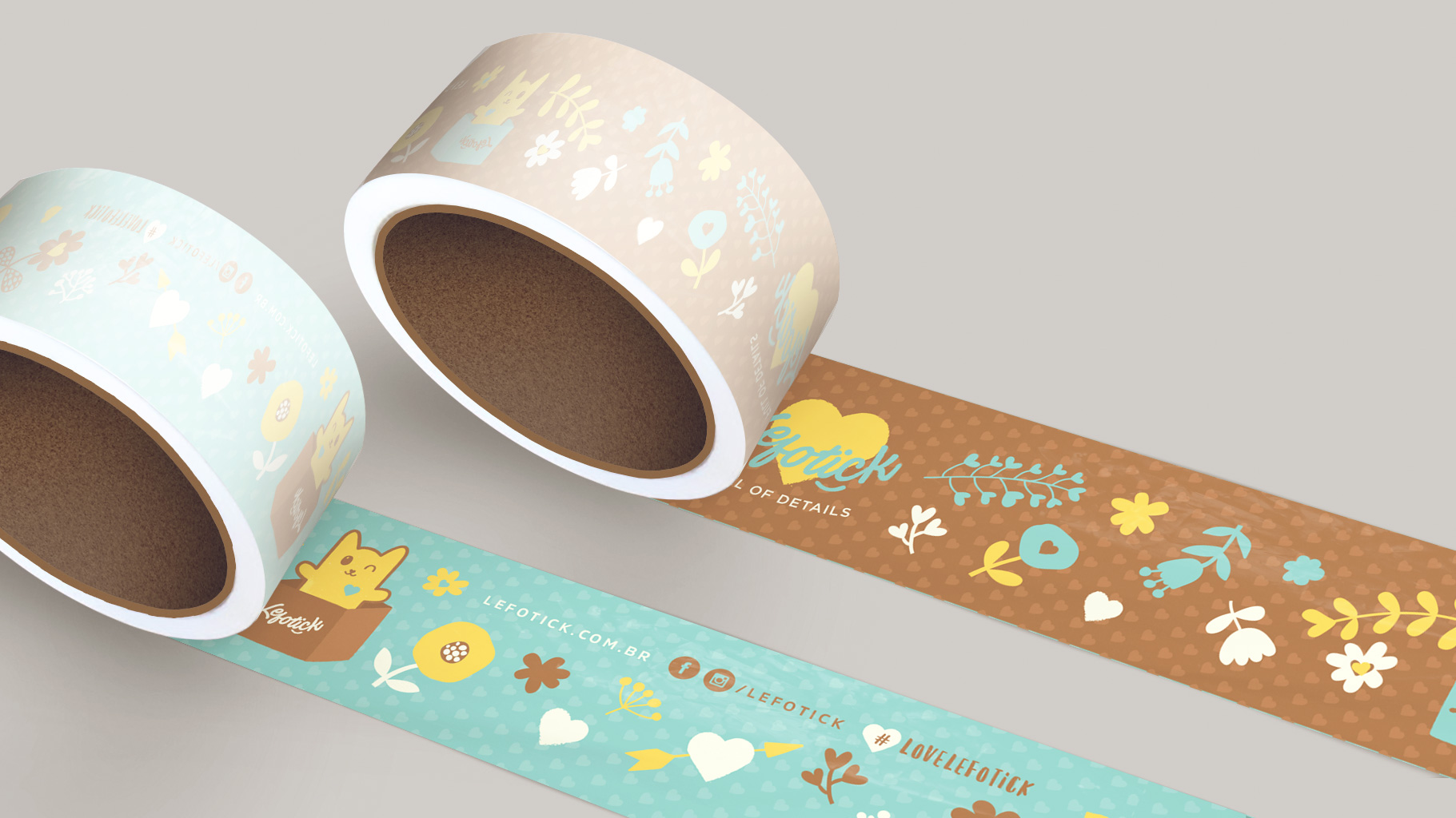
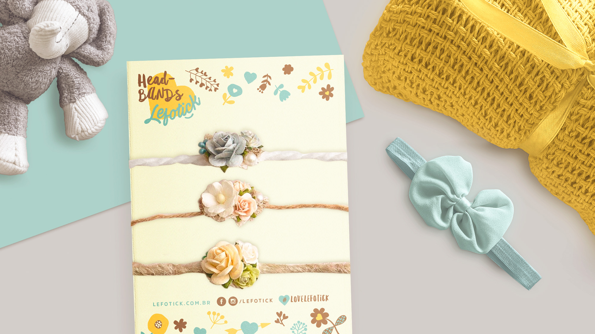
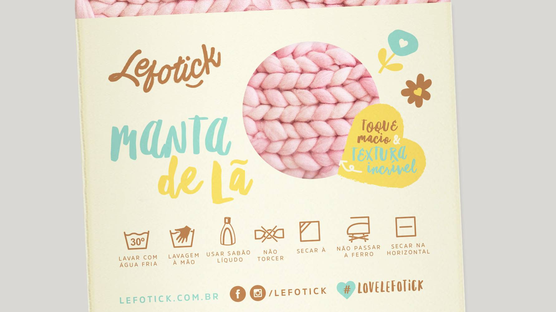
First visual identity proposal for the accessory store Lefotick.
I thought of creating a design that could surprise in the details, with a consistent development and creative communication (to interact with the consumer and of course to identify and oxygenate the brand). I wanted to create a concept that would reveal warm and welcoming environments, adapting to the various types of products and different applications.
At first I looked for a lettering with a light stroke, as if it was a handwritten note, loaded with humanity, feeling, care and affection. The symbol would be a kitten in different positions/variations, with textures and stroke by hand. Easy to apply and reproduce, with a main version and other complementary ones according to the product and/or purpose.
